For the last several months, I have been working on Jill’s house, and it has been an absolute blast! We have worked really hard, and I cannot wait to show you how it all turned out! I have broken the spaces into separate posts for organizational purposes, so stay tuned for the other spaces soon! Since the entry way is the first thing you see, I decided it made sense to start there!
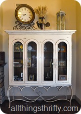
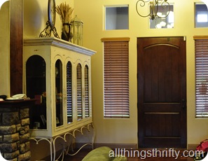
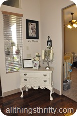
When I entered Jill and Matt’s home, the first thing I noticed was the BEAUTIFUL furniture that they owned. I was blown away by the pieces of furniture that were at my disposal. As you know, I LOVE FURNITURE. So, I was like a kid in a candy store when I got to see the amazing pieces they had lying around the house! Just take a gander at the amazing hutch and dresser they had in their entry way!
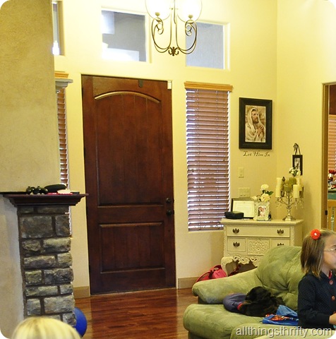
As you can see, the entry was beautiful to begin with. I LOVED the dark wood floors, the high ceilings and the welcoming layout of their home. It just needed a little pizzazz that reflected the style of their liking.
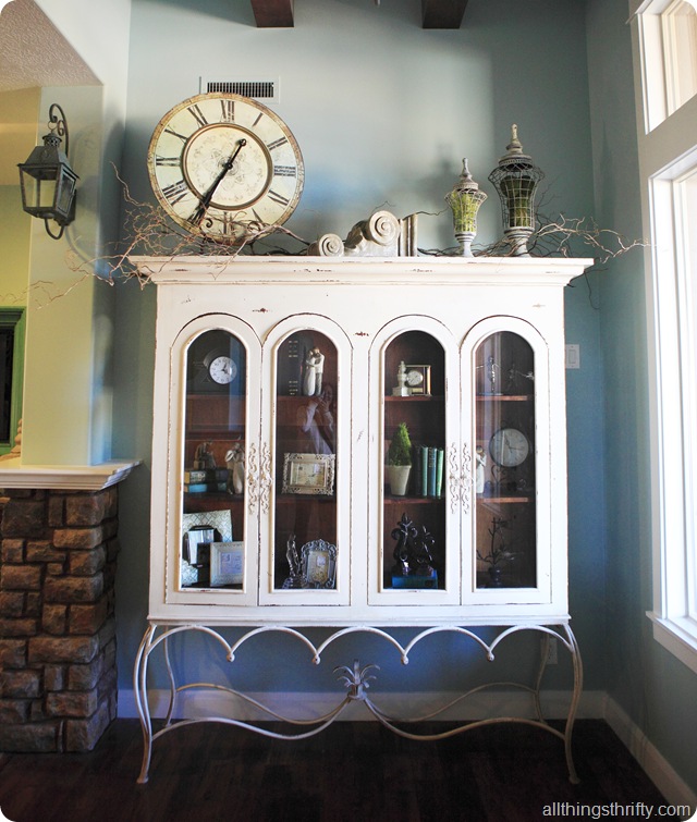
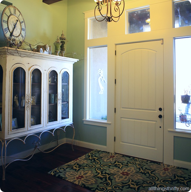
After several hours of space planning, I quickly realized that the hutch could not be moved because it would not fit anywhere else! Plus, it was the perfect scale and size for the entry way, so the bad boy was staying put. All it needed was a little update with accessories and changing the paint color on the wall made it pop right out! The cute cream dresser had to be moved though. I didn’t like that it had to be angled to fit in that corner. But don’t worry, you will see this beautiful piece of furniture again. 🙂
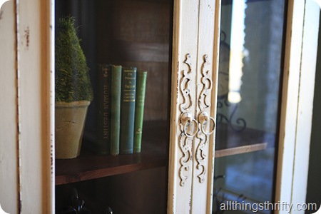
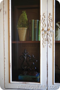
The hutch was gorgeous! The handles were intricate and the paint was chippy which I LOVED! For the inside accessories, I bought some perfect old books at the local thrift store for $2.00 each, used a lot of Jill’s accessories that she already had, and bought some fun photo frames at HomeGoods. The people at the local TJMaxx/HomGoods store began to recognize me. I was often the first person in the store and the last person to leave at night. It was great because every day they would bring out new items. So, I learned to return every day until I found the perfect items!
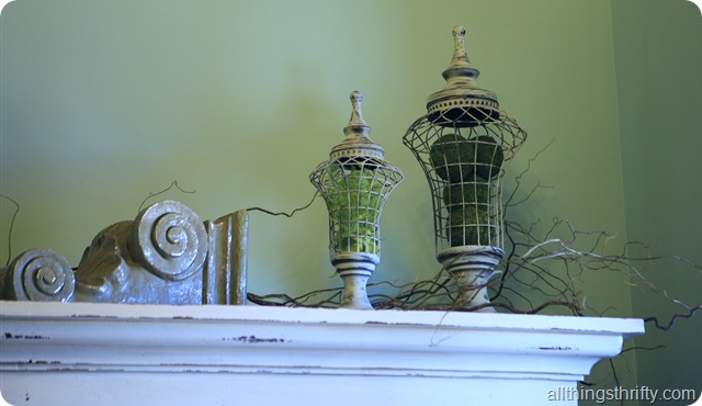 A great friend of mine, Leslie Thomas, helped accessorize the space. She even helped me shop at times! Leslie is wonderful, and I appreciate the time and effort she was willing to give during this project. She has 15+ years of experience, so it was great to have her stop by on a few occasions and offer her expertise and skills. If you are interested in a fantastic vignette designer, Leslie is the one. She is MEGA talented. I’m just lucky I could convince her to help me! I love the airy cottage feel that the accessories help create!
The clock on top of the hutch was bought at a local St. George store called Passport, and the rest of the accessories were from HomeGoods and Tai Pan.
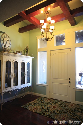
The paint color I chose is called Sauna from the Allen Roth Valspar Paint line at Lowes. It was the perfect choice (if I say so myself) because it is a breath of fresh air. The atmosphere is calm and bright. The entry way rug is an Amy Butler rug that we got for a STEAL of a deal on Overstock.com. I have checked lately, and the exact same rug is being sold for almost DOUBLE what we got it for! YAY for finding great deals!
It helped that the home was a blank canvas when they hired me. They were stuck in “all neutrals.” So, they needed a little boost to add some color. 🙂 Jill has great taste, but may have lacked a little confidence to make such a bold move. You can see in the picture below that the walls were tan before I got my hands on them! Are you like Jill and find yourself surrounded in neutrals and tan!?!
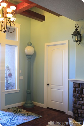
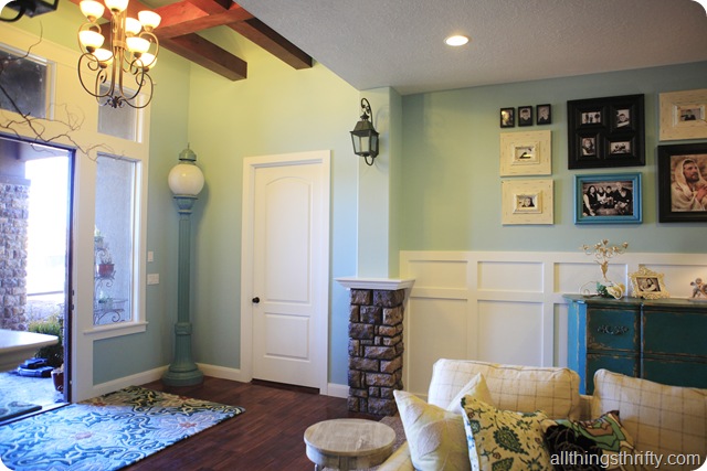
Look at the new paint, it’s soooo pretty! Plus, the light post I bought at the local Habitat for Humanity ReStore makes the PERFECT entryway accessory. It fits perfectly tucked in the corner and is the last thing people see when they are leaving. The cool thing is that this bad boy will soon be wired to turn on! How cool is that!?!? I want one for my house. Heck, I wish this WERE my house! I want to move in.
I hope you like the entryway, because as you can see, there is A LOT more to see of this makeover. Stay tuned for more pictures of Jill’s House coming up soon! Can you believe what a difference it makes to case in the doors and windows!?! I love window casings. It helps create the cottage style looke. Plus, take a look at that gorgeous board and batten! Matt (Jill’s hubby) did an amazing job with this finish work! Just wait and see what else Matt built for this transformation!
Random side note: The entry way beams were already there, and I LOVE THEM!! The only thing we have left to do is to order shutters or roman shades for the windows on each side of the door.
So……don’t be shy! What do you think!?!?
The after photos were taken by Natasha Williams of Photo Love Stories. She did a fantastic job!

It looks great! You made a great decision for adding casing around the door and windows – houses always look so naked without it!
The casing is definitely my favorite part–it gives everything a whole new look! I will *anxiously await* more information on how to do that, because it's something I've long wanted to do in my home.
WOW, I love it! That hutch is to die for and I love the rug. Can't wait to see the rest of the house.
Wow! I love how the casing around the windows and doors transformed this entry way!! It looks like a completely new home 🙂
The color looks so much more alive! And with that white casing…wonderful! Good job!
I too feel that the casing is amazing and makes that entry so intersting. Great Job!!!
wow, that rug is gorgeous! I love the wall color, too (: Beautiful.
The casing makes a huge difference, looks great. My favorite thing though is the light post, super fun. Can't wait to see what's next.
Looks fab! I really love the hutch with the stand. Where did the stand come from?
the hutch is gorgeous! i dont think i've ever seen anything like it, i love unique pieces of furniture, they give lots of inspiration for the rest of the rooms decor!
Love, LoVe, LOVE it!!! Way to go, chica!!!
I love this transformation! Love the color! Love the door & window casings! I love it all! And I want a light post like that!
Oh my word. I LOVE IT! The color is so dreamy!!! Can't wait to see the rest of the house!!! You are talented, my dear!!
Love it… everything about it!! The color is a wonderful choice. Not too bold, but enough to give it that calming feel and it makes the accessories pop in a perfect way. Great job! I can't wait to see the rest of the home.
The new paint color and rug are awesome! But, you said to be honest. The two light fixtures, the chandelier and the carriage light on the wall…not so much. Will you be switching those out?
I love the color against the molding and board and batten! I can't wait to see the rest!
I AM ABSOLUTELY IN LOVE!!! You are an amazingly talented woman! We just bought a new house in September, and it has SO much potential.. I don't even know where to start! It is neutral with Tans as well. You have given me inspiration to my creative juices going! 🙂
Thanks!!
The casing looks amazing!! along with the board and batten. Isn't is great how a paint color can change the entire feel of a room? I am excited about seeing the rest of the transformation:) Great job!!!!!
That's the shade of Blue I was dreaming of! House is beautiful! I'm heading to Lowes tomorrow for paint to redo a desk and table. Also, a big thanks for all your hints and tips…I've upholstered a chair,painted and glazed my old 70s oak kitchen table and chairs and I'm about to tackle more! Awesome work!
Wow! It looks amazing! The wall color made a HUGE difference and replacing the dresser with the light post was brilliant!
Love the new color! It's so light and airy! I'll admit I hated that hutch in the before pictures. It definitely looks like it fits better with the new wall color and I LOVE those wood "beams" on the ceiling! What a beautiful home. Great Job 🙂
It is beautiful. I love that the places you shop are the places I already go. I love seeing things through your eyes ~ it's simply beautiful.
I can't wait to see the rest!
LOVE the casing, and LOVE the hutch! Oh, and the rug and the paint color…the whole thing is super cute. I'd love to have an entryway like this. Our front door opens right into our Great Room. I've been racking my brain on how to make it more of an "entry way"…hmmm. Love this one!
We love how you accessorized with your HomeGoods finds!
Looks GREAT! It feels much more welcoming and refreshing. The hutch and the cased windows really brings out the height and grandeur of the entry and you filled it well! I can't wait to see the rest!!!
Absolutely Fantastic! My favorite is the board and batten wall with the picture collage.
hey girl! i love your work!
follow my new blog, if you wish of course….
http://allieandhusband.blogspot.com/
allie
New follower here…I love the lightpost in the entryway, the whole room is truly beautiful!
Jenny from http://www.modernmodestbeauty.blogspot.com
Looks amazing! Love the light blue color on the walls. It goes so well with the wood floors and white moulding.
This is beautiful! I keep checking your blog to see if you have posted the next part 🙂 Love the color choice and the furniture is fabulous. Excellent job, as always.
Seeing the whole thing first hand, I have to say it was absolutely AMAZING in person! I hope that my pictures did it justice! I really was blown away when I walked into the room! I do have to say in disagreement to a previous comment, the light fixtures are actually really nice and should NOT be changed out! LOVED everything you did here Brooke! You really do have an amazing talent for these things and you've inspired so many people with your handy work! Keep up the good work! One day when I have a house I'm hiring you to decorate! 🙂
The entry is beautiful. When I first saw that hutch I immediately recognized it from a hutch that I saw on craigslist this morning. Very pretty.
I LOVE this entry way. That color is fab. (no shock there 😉 I love that rehabbed light too. I need to go to my Habitat for Humanity REstore. I keep hearing such amazing things about it!
This space is awesome Brooke!
Hello! I have been a lurker for sometime as I found your blog via Pinterest. I have really followed along, be it from the edges, to see what you were going to do with Jill's place. I LOVE makeovers. I often do room redesigns for friends….just take there existing stuff and move it around. Anyway, what you have done here is just STUNNING! The casings and board and beams just make everything look so designer and polished. Kudos to you! I am off to check out post 2. By the way, I became a follower. 'bout time, right? LOL!
Hey I love your site soooo much!!! I was wondering if you knew the paint color name to the blue that was used on Jill's buffet and one matching picture frame? Thanks!!!
She has a beautiful home. I'm just wondering if I have those glass windows that frame the door, would it look nice to install some timber blinds in perth? We have a lot of those and I want some sort of privacy when it comes to windows.