Every year I love to announce the color of the year by Pantone! If you missed the colors from 2012 and 2011, check them out!
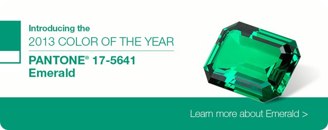
The announcement was made yesterday for 2013, and the color is….
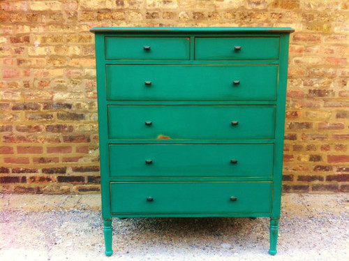
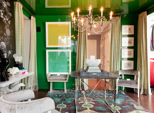
EMERALD!
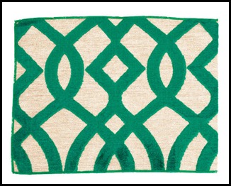
Photo source: Elle Décor Photo source: Elle Decor
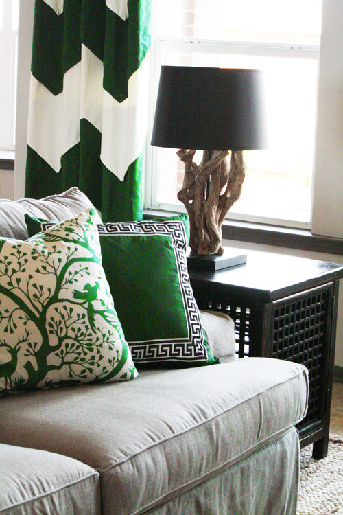
Eclectic Family Room design by Atlanta Interior Designer Cristi Holcombe Contemporary Dressers Chests And Bedroom Armoires design by Other Metro Etsy
What do you think about this choice?

Hmm Not really diggin it. I am kinda disappointed. I have spent a good part of this fall trying to get rid of the green in my house.
Thanks for sharing!
exotic! i think i may be able to use emerald as the accent colour in my bedroom…need to see first, its currently red and white (more country chic) with black accents….methinks emerald would be better though.
I am so excited about this! I just got the prettiest fabric with hints of emerald in it. I can't wait to see the clothes with this color too! One of my favorite colors to wear!
Yaaaay a green color!!! Green is my favorite color and I'm so happy to see all this green in the forecasts for both home decor and clothes!
it's okay in VERY small doses. No emerald walls or sofas for me. I don't know about wardrobe…maybe as a touch in an accessory.
Not feelin' it. Every 7 years or so, they try to make emerald happen, but it doesn't work. It tends to be too overpowering for decor, and in fashion, it requires a very specific skin tone to shine.
ACK!!! Small doses are lovely but, that's it for me.
Now that is a color I could dive into! It will be fun watching to see where all Emerald pops up. But for me, nothing will ever top the 2008 color of the year, Blue Iris. It was always my favorite color so I was delighted to know it's official name.
Nope. Not for me. Sometimes those colors of the year just don't work. This one doesn't.
Sadly, I am not a fan of emerald. I will say it's better than last year's tangerine. Guess I'll just keep on doing my own thing!
I love it!
It seems almost every year I turn my nose down at the Pantone color of the year selection.Then, when the color finally hits the product shelves here in Utah, I find that I'm in love with the color–especially in ribbons for weddings. One of my favorites that I really announced my dislike for, is the gray and yellow combination. I still love doing gray and yellow weddings.
I love this color. I just wrote a post about how I was going to use that color as an accent color in a room I'm decorating. Guess I got it right this year.
UGH! I love this color, now it's going to be everywhere and everyone is going to have it!
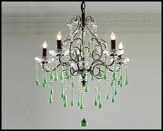
The first picture of the chandelier with a touch of green – it's truly relaxing in the eyes. Mostly because GREEN is the easiest color in the eyes, plus, chandeliers do illuminate the room, giving it a calming ambiance. This is why most of the spas I've visited in London have green-hinted chandeliers.
I just love green walls. It matches any part of my house, plus, I love sticking decals onto it just to give some life. I only have a few furniture here at home, so I just design the walls to make it more lively. The chandelier is gorgeous! Thanks for sharing!