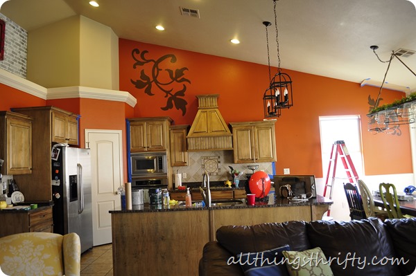
Back in 2009 I painted our kitchen ORANGE! I even painted the decorative designs with the help of an overhead projector. It was a fun part of our home for over 3 years, but I am really excited for change and an update! Sometimes when I tell people what I’m doing in my house they look at me like I have three eyes. But, too bad! I need to love my home, right?!?! YES!! I have always needed change often, even before I had All Things Thrifty! It might drive my husband crazy sometimes, but he’s getting used to it! We’ve been married for 11 years, so he better be by now!
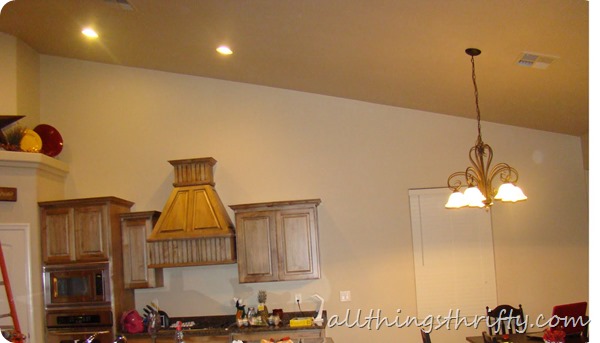
So, let’s get right to the transformation! Our kitchen looked like this when we moved in: I call it our BLANK SLATE!
 Here is a picture of the orange kitchen on the morning that we started painting over it! Disregard the clutter!
I am in love. We painted it with Sherwin Williams Emerald paint in Raindrop. It only took 1 coat in most places. I was very impressed. We did two coats of paint though.

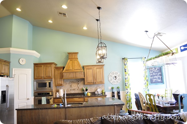
It is the perfect farmhouse fresh feel that I was going for! 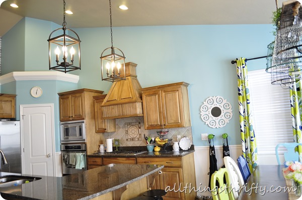
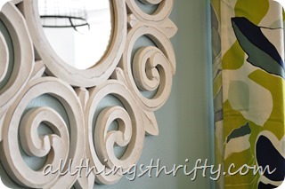
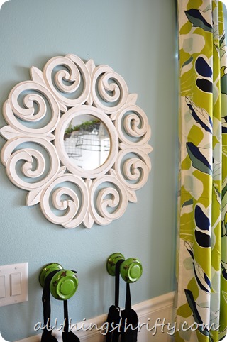
The mirror is from HomeGoods, and the curtains are from IKEA.
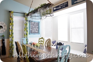
We built the light fixture for above the table, and we will be posting that tutorial soon, and I bought the fun green knobs for our aprons at Tai Pan, a local home décor store.

xoxo,
Brooke

Wow, what a difference. I can’t get over how great it looks. So fresh and pretty. The light fixture over the table is awesome, too.
Your kitchen looks beautiful ! Love the color 🙂
love this new room of yours. I got the kitchen chairs going on in my kitchen too. Always looking at Good Will for some new/old chairs.
Those are my FAVORITE IKEA curtains! They look awesome with the color in the kitchen!
What a great color.Changes the feel of the room so much. Very nice!
I liked the orange but I love the blue. Great choice!
I was surprised that I liked the orange but I absolutely love the blue. It looks awesome and probably makes things feel a lot bigger!
I want to do the exact same clor you are doing! We have orange walls frm the living room that has 20′ ceilings to the kitchen that shares the same wall and its orange just like your. The coor is called “Faded Clay”. Long story short, …Im over it and ready for a light fresh look. I DESPERATELY need to win this!! Thanks for the giveaway, and the push to my tush to get motivated to repaint!!
carriesummerlin at yahoo dot com
LOVE it!
Looks great Brooke! I love the color and those curtains are beautiful! Looking forward to seeing that fun light tutorial 🙂
100% ABSOLUTELY LOVE IT!!! LOVE. IT. 🙂
Oh it is so beautiful!! What a fun happy shade of blue! I love this room, everything you have in there is soo pretty and fun! I can’t wait to see how you made that light! Sooooo cute!
I adore the new color! It is so much more bright and cheerful now. 🙂
Absolutely love it! I actually painted my living room Sauna from Valspar after seeing the transformation you did on Jill’s house! I also purchased yellow curtains because of that redo. I don’t have the awesome furniture pieces she has but I am very happy with my LR thanks to inspiration by you! Wish you could come over and see it 😉
Love!!!
So light and bright and BEAUTIFUL! Love it!
I love the color and can’t wait to see the tutorial on the light fixture!
Beautiful! I bet you fall in love with it a little more each time you look at it! I love the mismatched chairs at your table. Enjoy your new room!!
Soooo much better than the orange! And we have those same curtains but in purple and grey!
oh wow, Brooke! I LOVE that color – it’s so fresh and light. I also love those little green knobs – perfect touch for the space. Great job lady!!!
I love the new look, I saw the video you shared while it was being painted. Looks amazing…so beautiful.
Debbie 🙂
I love how bright it is now!
If you’d have had this done when I started my room it wouldn’t have taken me so long to decide! I am in love with it!!!! At least I did it before you did yours so I didn’t ‘copy’ you…haha….and I wanna STEAL the light fixture over your table…and your chairs…and… okay I’ll stop so you’ll still let me come in your house. LOVE YOUR FACE!!!
Been trying to decide on colors to paint in my living room and kitchen…I LOVE your kitchen! 🙂
very pretty Brooke! so bright and cheerful now! light fixture is AWESOME! can’t wait to see exactly what you did!
I love this color Brooke! What a gorgeous transformation, cannot wait to see the tut on the light fixture too 🙂
xo, Tanya
twelveOeight
That’s the color of my kitchen. You have excellent taste. I need to go to IKEA and get those curtain.
I love this tutorial. The blue makes it so much brighter, it’s gorgeous. I just moved into a new townhouse so i have quite a large painting project list. 2 little girl’s rooms, a master bedroom, a living room, a kitchen, and 2 bathrooms. I have my work cut out for me. I would love to win this giveaway to get my painting projects underway. And to bring my new baby home to a freshly painted house in May 🙂
haylimay@gmail.com
Gorgeous! Love the happy colors on your chairs too! What a lovely, fresh room.
Love the wall color and how put together it looks.
Good change for a beautiful kitchen!
I love the wall color and the curtains too. It looks so bright and cheery!
As I was scrolling down I thought “I LOVE the orange, so much better than the blah-eige.” Then I kept scrolling and saw the Raindrop. I inhaled. And kept it there for a few seconds. So gorgeous! Fresh, clean, bright… GREAT JOB!
I actually really liked the orange, but I could see how you might get tired of it after a few years. The new color and features are so fresh and pretty!
I absolutely love how your kitchen turned out Brooke! I ALWAYS love your style and the way you put things together…amazing!
You’ve got the right idea! I am in LOVE with turquoise and have founded that every room I paint is some shade of it! My favorite shades of turquoise are SW Rain Washed, and Window Pane. My blog has pics of all my turquoise spaces.
Serena
Thrift Diving
How do you paint your chairs? Where do you find them?
Brooke I LOVE it! It is so fresh and bright. I feel like the blue soaks up so much natural light and spreads it all around. You did a great job. 🙂
Love the color, it looks great in your kitchen. Looks light and airy.
Super pretty! The new look is so fresh and fun. Love “the Pan” as we call it, I always go by when I am down in CA.
It is so pretty!!! I love it! The difference is crazy! I love how you painted the chairs and I esp love the mirror! Thanks for sharing! Julia @ http://www.juliakendrick.com
I don’t like it…I LOVE it! The color is so fresh and cheery! Definitely a room you would want to spend a lot of time in. I think I am most in love with your painted chairs! I am such a fan of mixed chairs. I can’t wait to see the tutorial for the light too!
Ginger
Literally Inspired
I love it!
Oh yeah, I love it. But I am particularly entranced by your colorful set of dining room table chairs.
It’s lovely – very fresh, pretty and farmhouse lovely! Have you considered painting your island in either white or one of the fun chair colors? It might be just the thing with all the pretty white trim and lovely blue walls.
So beautiful. Like a breath of fresh air. Great job!
Never would of considered a blue, but this is very beautifully done! So refreshing, I love it!!!
Fotini
awesome Job Brooke! I love the color that you chose. I am not usually a blue person, but you are changing my mind!
Great job girlie!
Beautiful! Love that Raindrop color.
I absolutely love it!
I absolutely love it!
That looks amazing:-) I have a red wall I’m looking to update…did you use any primer before or just paint right over the orange? Thanks!!
Loooove the blue! The orange was so fun, but its definitely nice to switch things up after awhile! It looks great!
That is pretty close to the color I’ve been wanting to try in my kitchen/dining room. But I’m hoping to add some wainscotting like you did in your entry. Seeing this gets me even more excited to do it…just gotta find the time now!!:) Looks fabulous!
This color transformed your kitchen and elevated it to a whole new level..I love, love, love it!
Awesome color. Love it! The chairs are some of the best mismatched I have seen and how creative with the hanging decor above table!
I AM OBSESSED!!!!!!
Amazing job and color choice! I love the lime and navy accents too! Gorgeous gorgeous!
XOXO Mallory @ Classy Clutter
It looks AWESOOOMMMEEE!! Fresh and springy. And I love those new curtains. I’m dying.
Beautiful. I’m so happy to see this, because I wanted to see how light aqua and wood cabinets looked together and had no luck finding kitchen pics with that combo. I still think I have my heart set on butter yellow for my new kitchen but I may change my mind.
Happy is the perfect word for this room! Love it!
looks so clean! but what i really love is that you haven’t painted those beautiful cabinets. they are sooo unique! do you know what type wood they are & stain that’s used on them? they go so nicely with that beautiful shade of blue. great job!{enjoyed visiting your blog!} sarah
This is gorgeous! I have the SAME color orange in my sunroom and getting ready to switch to green apple color! It looks fabulous! Huge gorgeous change!
‘Ya got that blue right, it’s beautiful. But I always forget, which color is it that stimulates the appetite and which is it that suppresses? If it’s blue to stimulate, let me know if you gain weight so I can cross that color off my list.
Bliss
Love the color, Brooke! So much brighter and bigger feeling. 🙂
Okay, so I want your curtains! Are they still for sale at Ikea? I looked online, but didn’t see them…. was it fabric that you made into curtains or actual curtains? Love the whole room! Those colors would look fab in my great room/kitchen!
Yes Genelle, The still have the curtains. Online, they only show the grey and purple option, but they are still in the store. I think they might be a new item because I had never seen them before! They are actual curtains, and if I remember right they were only about $25.00. 🙂
Thanks, Brooke! I went today and found them. There were three packs left on the shelf. I grabbed two and a lady right behind me grabbed the last one. They must be pretty popular!
This is a similar layout as my kitchen that we will be updating and I was thinking of this sort of color.love how this looks. BTW what is the color if you don’t mind sharing.
Traia, Somewhere up there in the beginning of the post (I think maybe under the first picture)she mentioned that it was Sherwin Williams Emerald paint in Raindrop. Hope that helps!
Oh darn I should have read them All thank you thank you so much Genelle
I love how you used the pale blue with a quirky green to change things up. Too many people are afraid to mix pale and bright in a room. You show that they can work together to make a playful yet serene environment. just so beautiful 🙂
oh, I love it. I loved your orange but the whole room looks so much more alive! I can’t wait to finally finish my kitchen.
Love your ‘new’ kitchen! So fresh and beautiful! Awesome job.
I know you are supposed to capitalize because it is like screaming, but I LOVE, LOVE, LOVE how it is turning out. Thanks for sharing.
This is so beautiful and fresh feeling. I love it! You did a great job on this, what a transformation!!
I absolutely love that colour. I have that colour all over my house but not in my kitchen . . . yet! It is such a happy yet calming colour.
It’s amazing!!!! I think it was time for the orange to go!! I bet your white washed brick looks even better now!
I LOVE IT!! I just painted my kitchen blue and it makes it feel so light and airy! You rock!
This encouraged me to paint some things n my house turquoise. Believe it or not… I REMEMBER when it was popular before in the 60s… I’m sure u weren’t around then ~~~ and I’m loving my new pops of blue in the office.
Take a looksey… hippiesmustusesidedoor.blogspot.com
I love that color blue for the kitchen. It made it look like your kitchen was a little bit more open. It looks great 🙂
Great color choice it looks like it feels much more peaceful. Love the kitchen table lighting Im making something similar from a couple baskets at hobby lobby.
LOOOOOVE this!!! You still have wood cabinets (as do I) and I keep ho humming about the paint color in my kitchen!
I absolutely adore the different colored, mismatched chairs! The whole look completely makes my day–as other readers have commented, I too love those curtains and am thinking about them when the manfriend and I move in together to our first place next month!
do you have all the paint colors you use in some post? i love the color of the doorknob hooks! is that regular paint or spray paint? the walls, the chairs, the chalkboard frame?
your makeover looks great!
??? 🙁
I bought the doorknob hooks that color, so I don’t have the exact color for you. The chalkbaord frame is painted with “backstroke” by valspar. The blue wall color is called “raindrop” by Sherwin Williams. The chairs around the table are painted with Krylon Ivy Leaf, Krylon Ocean Breeze, Krylon Ivory, and Krylon Navy.
I hope this helps!
xoxo,
Brooke
Love the pictures above the window of the utencils. Can you share if you made these or purchased them? What do they say under the utencils? Super cute!
We made them! Check out the post: https://allthingsthrifty.com/2013/03/kitchen-signs-and-silhouette-giveaway.html
Where did you get the light fixtures above your kitchen island? I LOVE those 🙂
We got them at Home Depot! 🙂
Do you know the name/brand of the island light fixtures? I am searching homedepot.com looking everywhere for them 🙂
HI Lauren,
Yes, the lights are Broyhill brand from Home Depot. I hope you can find some in your area. They were on major clearance when be bought them. I think they were $17.00 each! Good luck!
Love,love,love the color and the fixture above the table!!! Please post how you did the fixture soon:)
I know this is a weird thing to ask, but do you happen to know the brand of the mirror in your kitchen that you got from HomeGoods?
Stephanie,
I just looked on my mirror and it doesn’t have any sort of branding on it! I’m so sorry! I wish I had better news for you!
Loving this transformation. Just stumbled upon your blog from Pinterest looking for curtains. I’m following along from now on! 🙂
I just stumbled upon this post on Pinterest last night and haven’t been able to stop thinking about it! I’m the kind of person that needs to see examples of other people’s rooms that have a similar layout to mine or I have a very difficult time transferring that to my space. When I saw this post my jaw about dropped and I’m pretty sure a chior of angels might have been singing to me. 😉 Your kitchen layout is almost exactly like mine! I don’t have a window against the back wall, but the size of the kitchen appears to be the same, your island is shaped a little differently than mine but it’s in the same spot and takes up the same amount of space, and I did a little happy dance seeing that I could envision some new things for my kitchen! Our house was new when we moved in a little over a year ago and this is our first home. We’ve been married for 7 years, have three little kids, and have rented and been in school the entire 7 years we’ve been married so I’ve never gotten a chance to really be able to create a beautiful living space for our family. Anyway, on to my point, I’m thinking that if your kitchen is almost exactly my layout, the transition from your kitchen to your living room might be similar as well. I’d LOVE to paint something in my home this color but with such an open layout I’m not sure how I could pull it off without painting everything. Clearly I’m not open-minded enough in the home decor department to see how I can do much of anything. 😉 And I’m too scared I’ll make a bold move and not like it (that’s when the hubby starts to think I’m insane!) Do you have any other posts showing from your kitchen to the rest of the main house?
I took one look at your kitchen (which, by the way, I love the blue!) and thought, “That is a Utah home”. I used the search option on your site to search “Utah”, and sure enough I was right. I am a Utahn who has lived in CA for the past 23 years. I have been stalking your blog this morning and love your style. Thanks for sharing!
Beautiful! I wish I could see the pictures bigger! Love the color of the walls and love the curtains too!