It’s crazy how fast the months pass… seems like I was just here guest-posting last week! I guess summer festivities have that affect on us. Am I right?
Oh yeah, I should say this is BETH, stopping in from Sawdust and Embryos! I love stopping in here at ATT! Man… major privilege!
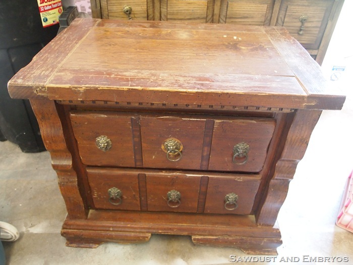
So today I’ve got another tutorial for ya! We’re going to learn together how to create a ‘raised design’ to bring dimension and detail to a piece that may otherwise be… well, tragically boring. Take this big boxy side table for example:
Yeah yeah, it’s solid wood… and has nothing structurally wrong with it. But it’s such a simple design, with no real personality. Sure, you can paint anything a fun bright color and bring it back to life, but if you’re planning to glaze (like Brooke so eloquently teaches us), you need an element of interest for that glaze to come out of it’s shell and introduce itself.
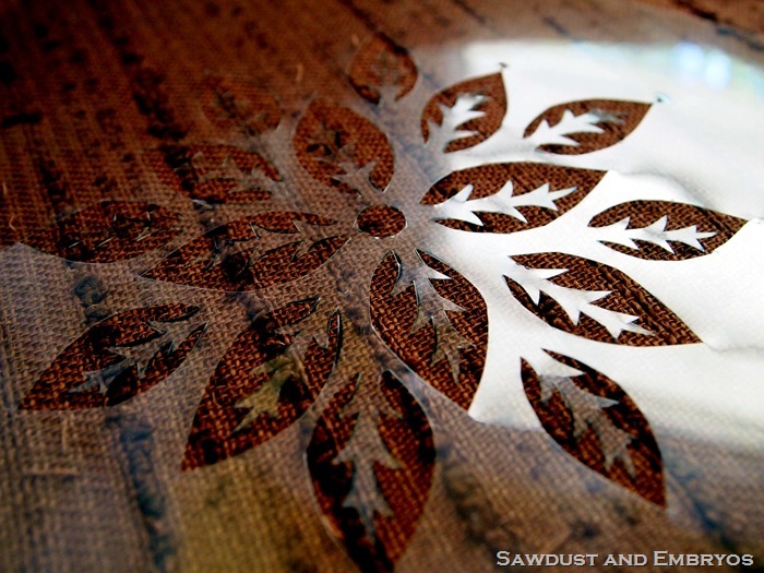
SO… using our girl Brooke’s sweet free printable stencil design, I sized and printed this here little beaut onto a transparency:
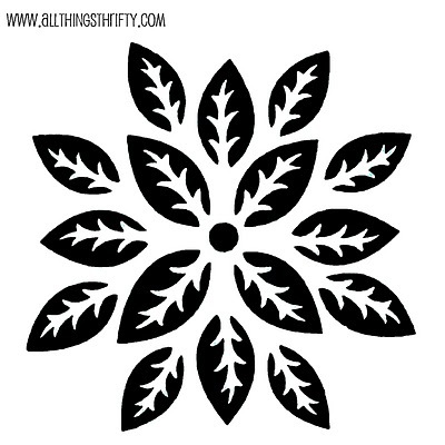
Then, using the same techniques from my Make Your Own Stencil Tutorial, I spliced it to pieces real simple-like. Took me, oh… about 30 minutes.
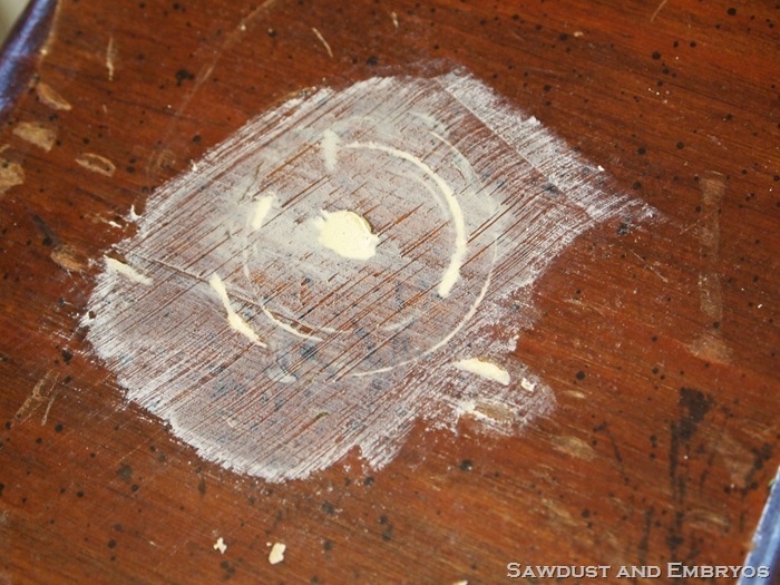
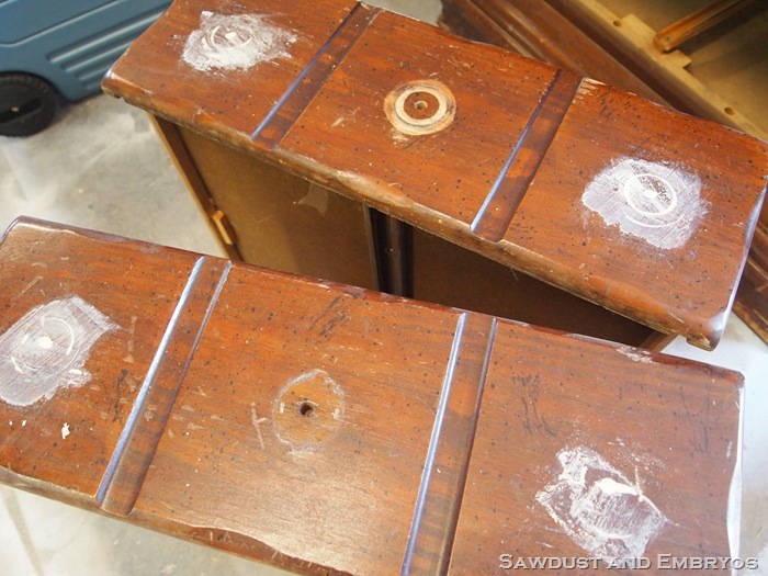
My next step was to remove all the hardware from the drawers, and fill the outer holes with wood-putty (because I only wanted hardware on the center of each drawer). And after it dried, sanded everything down using 120 grit sandpaper.
Next I centered my stencil in the square (the hardware hole was not centered… good thing I checked!), and taped the corners to keep it in place.
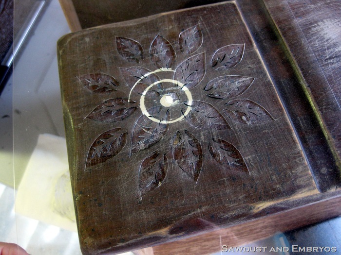
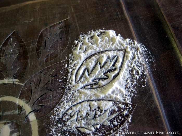
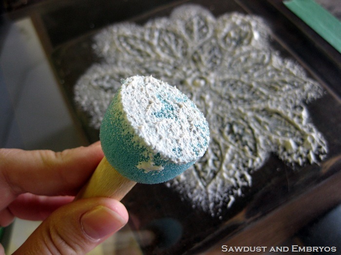
Now this next part isn’t an original idea of mine… I’ve seen it done before. But I’ve never seen a tutorial, so I just kinda went for it! Using a little round foamy stenciling brush and a glob of simple joint compound on a paper plate, I started blotching it onto my stencil! This part is super fun! Maaaaaaybe a little therapeutic even!
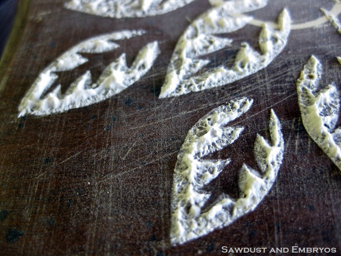
And bada-BING! Look at this sweet madness:
Let ‘er dry, and hit it with prime and paint!
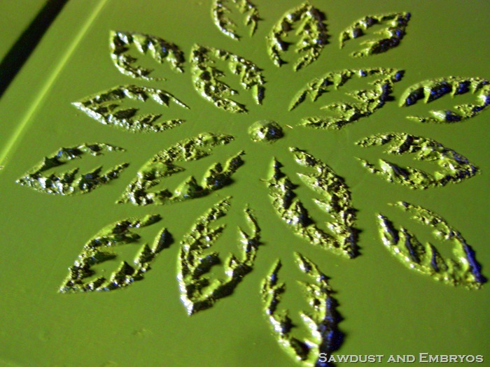
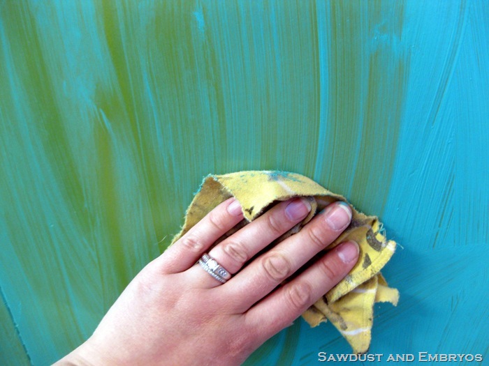
I wanted this piece to have a messy aged feel, but still be bright and a little obnoxious… so I smeared on some acrylic paint and wiped most of it off, just like glazing. (I used Apple Barrel Turquoise if you’re wondering!)
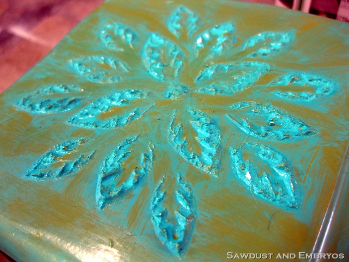
And after that dried, I used a brown black glaze mixture to make this bad boy look all rugged and handsome-like. Messy glazing is my favorite. The less attention to detail, the sweeter it looks!
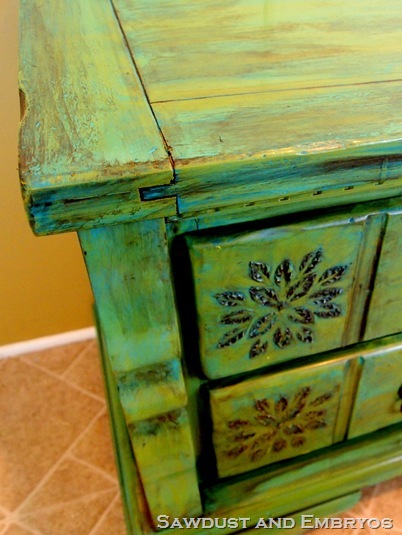
And do you see how that design pops out and gives this piece some serious visual interest? And the sweet part is, the sky is the limit. You can use any design you want to create a one-of-a-kind piece!!
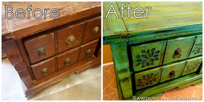
Now get off your little booty, and go create something this weekend! But not before you head on over and dink around our blog Sawdust and Embryos. Happy weekend to you!

What a transformation!! Gorgeous : )
I am going to try this compound stencil thing on a project soon. I hope it turns out as great as this did. thanks for the inspiration.
Tobey
man this is AWESOME!! I love this technique and it looks fabulous on this piece!! congrats!
I HAVE BEEN DOING THIS FOR YEARS…I MAKE ALL KINDS OF SIGNS AND ART…VINYL SPACKLING WORKS THE BEST..IT TENDS NOT TO CHIP OR CRACK AS MUCH AS REG WALL SPACKLING WHEN YOU USE IT ON CANVAS
That turned out beautiful! Love the colors you chose!
That is absolutely gorgeous!!!! I love the green, and the glaze is amazing. I am excited about using compound in stenciling … that makes it pop! Thanks for sharing. (:
I gotta say… I wasn't sure where you were going with that at first… BUT the finished piece is absolutely gorgeous!
I'm having a Summer Time Giveaway on my blog this week if you get a chance to go over and enter. Its a $50.00 gift certificate for NOVICA.
Thanks… Keep Cool!
http://theprojecttable.blogspot.com/2012/06/its-summer-time-giveaway-from-project.html
Rainey @ The Project Table
That's amazing! I've never seen that done before!
Lindsey Turner
http://thriftandshout.blogspot.com
wow!! that is awesome!!! I'm sharing it with my friends.. thanks for the tutorial!
http://www.studentswife.com
Thanks for the ideas! I have lots of little wooden jewelry boxes to customize! I love the little drawer pulls on this one, the little lions heads! They are great!
Ha ha I just realized how big this was! I was thinking it was a little jewelry box! Still cute and I could do this to a jewelry box!
I’m going to have to try this. I’ve stuck to 2-d items, but this looks so cool and pretty easy.